
What am I paying for?
Customers kept asking support that, along with two more questions:
- What am I paying with?
- How do I stop paying?
The account page answered none of them.
Account redesign
- Problem
- Customers are confused by the account page because it doesn't answer the questions they came looking for.
- What success looks like
- Customers talk about how DNSimple helps them manage their account with ease. More referrals, more customers.
- Must and must not
- Must show urgent matters about the account
- Must let people switch back to the old page
- Must not get in the way of advanced users who know exactly what they want
The problem
DNSimple's account page followed the way the app stored data. Billing sat behind its own menu item, next to sections that mirrored our Rails models. If you wanted to know why your invoice was higher this month, you had to know where we kept extra zones and email forwards.
Support saw the result every week. The same three questions came in over and over, and each one meant someone had looked at the account page and given up.
What I did
I talked the approach through with some members of my team, then designed and built it. I wrote the problem statement, the three pull requests that shipped it, the feature flag and the counters behind the rollout, the support article, and the blog post announcing it.
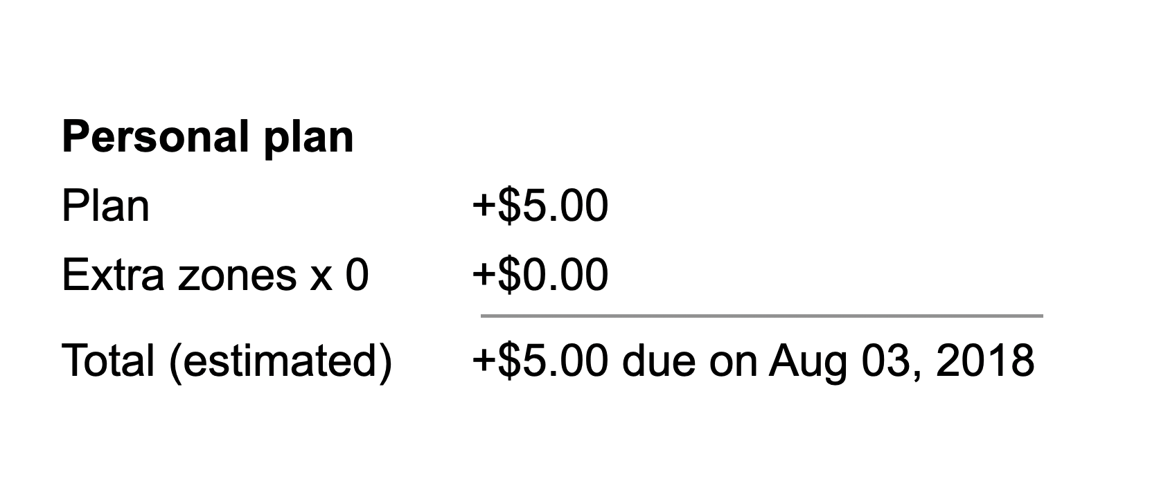
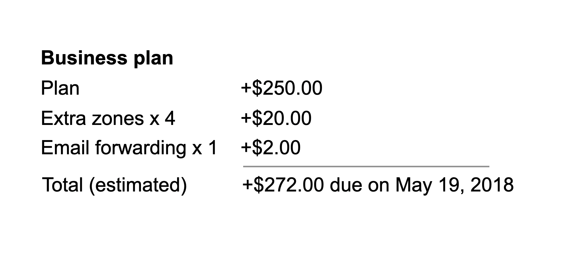
The first question took the most work. A plan price isn't the bill. Extra zones, email forwards, team upgrades and account credit all change it, so I worked through real combinations until the breakdown read like a receipt.
Two takes
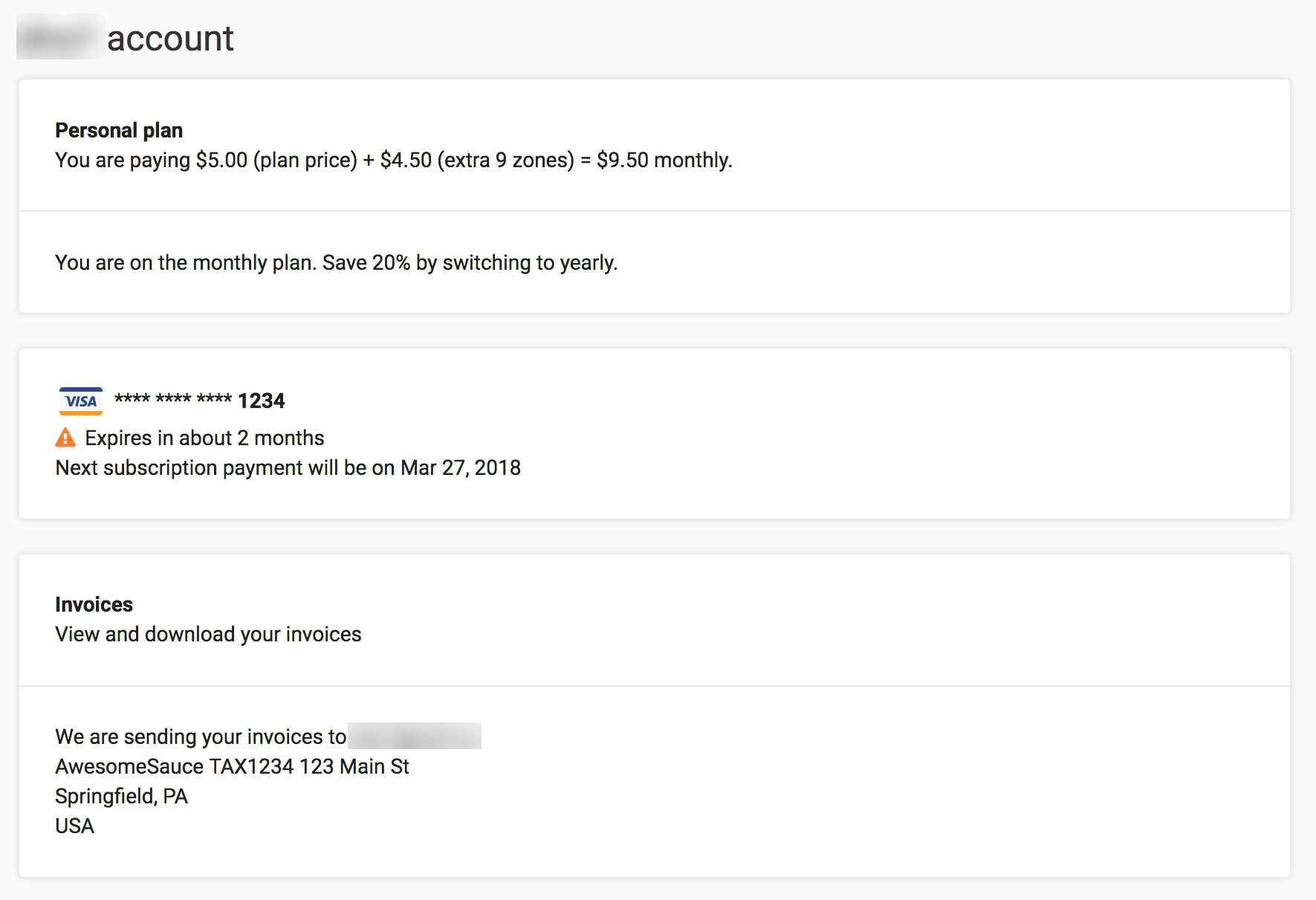
The first version answered the three questions, but I got too ambitious with the changes. I dropped the sidebar and put every account section on one long page, with each action as a big clickable row. I shipped it behind a feature flag with a button to go back to the old page, and asked teammates to try it against the three questions.
Everyone agreed the answers were clear. The feedback was about getting there. One teammate's first impression was a "big wall of text." There wasn't enough contrast until the end of the page. That was a fair catch, and an easy one to fix. Another suggested bringing what worked into the account page we already had.
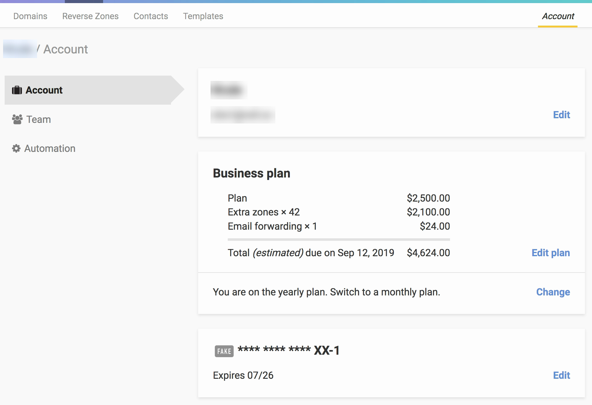
For take 2 I kept what worked, the three answers and the plan breakdown, and brought back the structure people knew. The sidebar returned with fewer items and a new Automation section. The cards kept their familiar shape but got clearer actions, and the page moved to 16px type on a three-column grid from our design system. The same reviewers approved it.
Outcome
Over five weeks behind the toggle, people kept choosing the new page and very few switched back. The spike on the first day is us, testing. In September 2018 I removed the old page and wrote up the change on DNSimple's blog.
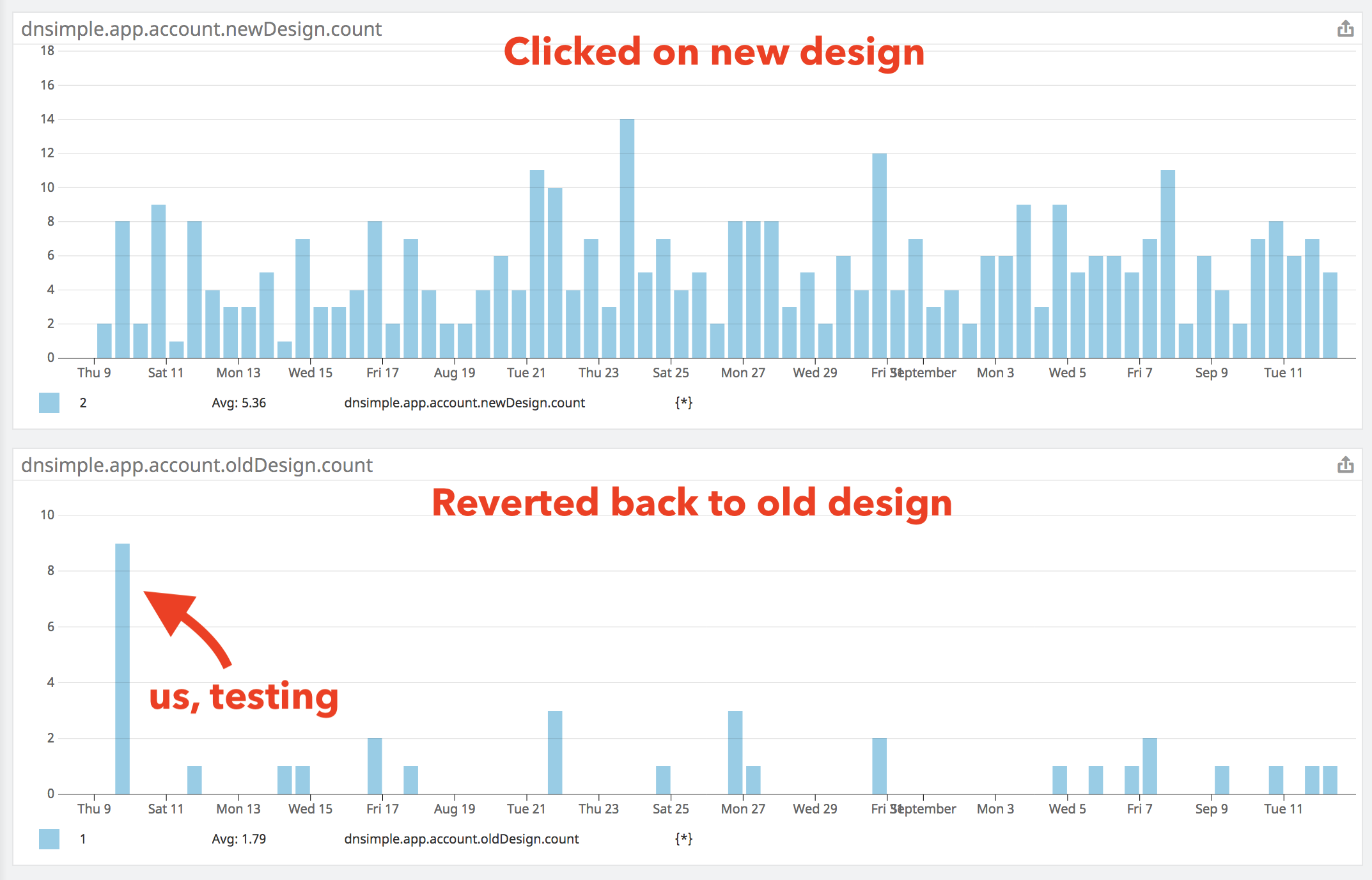
The design is still on the account page today, and it rarely comes up in support.
- 3 pull requests: one discarded, one merged, one removing the old page
- dnsimple-app
- Mar–Sep 2018
- 5 weeks behind a feature flag